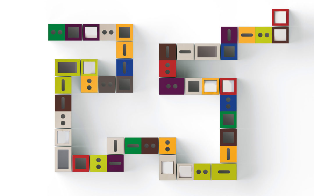
Colors are essential to any design project and narrowing down to a specific color scheme can be a difficult task. One main thing to keep in mind as you start designing, is the atmosphere you want to create. If your clients are coming into your office, how do you want them to feel? Secure? Encouraged? Impressed? Inspired? All of these emotions can be provoked through the correct color applications.
Warm colors: red, orange, brown and yellow, are inviting colors that make others feel comfortable in a space. However, too much of any one of these colors can be overwhelming and have the opposite effect. These colors need to be used in influential locations, mixed with neutral colors.

Watson, Tonic Table and Benches
Orange and Yellow both inspire happiness and excitement. They can be used as features to brighten up a dull space, but not where they will distract from important tasks. Keep in mind that, yellow and red specifically, are used on caution signs, so the human brain recognizes them as warning colors. Choose hues that are different enough from common signage, so they can be used to trigger other emotions
 Arcadia, Co-Op Series
Red is a unique color in the design world because of its intensity. Most shades are known for being comfortable and warm, yet they still draw attention so they can used to highlight important areas, information, or locations.

Arcadia, Chatter Stools, Vero Table
Cool colors are known for their calming and relaxed environments. Blue is considered the most tranquil color, almost to the point that is has the same visual effect as a neutral. Bright blue can cause a more excited feeling, but most tones of blue have a similar effect on our subconscious as grey does. Areas like medical waiting rooms, breakrooms, and living spaces are great locations for blue furnishings and paint. Even bathrooms can have a clean and cool look with blue interiors.

JSI, Connect Modular Lounge
While green evokes similar emotions, it also has a more exciting effect than blue. The color green is often associated with grass and trees, which gives it a nice natural feel. Lighter shades of green can add as much excitement to a space as yellow, and are great for collaboration areas and studios. Darker, olive shades of green have a very natural and rich feel.

Watson, Tonic Bench
Neutral colors are great fillers, and actually create more atmospheric emotion than you might think. Black and dark grey have a strong presence, almost as much as a vibrant red or yellow. They create contrast and thus speak loudly. Black is associated with strength, authority, sophistication and glamour. When used properly it can make a lobby, conference room or an office look stately and well-defined.

Watson, Miro Desk
While most people avoid white furniture because it can be a cleaning challenge, the color has the potential to make quite a bold statement. White interiors are classy, clean and can have a modern, futuristic appearance if styled the right way. White and light neutrals showcase textures and 3-dimensional designs to the height of their potential. They are also perfect for environments that need to have to be sterilized.

Nevins, Opus Conference Table
Typically interior spaces don’t contain only one color, so learning to combine colors effectively is crucial. The easiest way to combine colors is be noticing how they relate to each other on a color wheel. Contrasting colors work well together to create a dynamic space. These are colors on the across from each other on the wheel, so blue and orange, pink and green, purple and yellow. Because of their innate differences they enhance each other and capture the viewer’s attention.

JSI, Collective Lounge
Another safe combination is much more common and creates a simple and less exciting environment. Colors next to each other on the color wheel also enhance each other but also work together to encourage similar emotions. These combinations create more of a monochrome environment and are really effective when trying to encourage a specific emotion.

OFS Brands: Kintra, Rowan, Tiffany
Don’t be afraid to experiment with color in the office! It can be a great way to divide spaces, from public to private; focus to collaboration environments; and lobbies from exam rooms. You can ease patient nerves with warm colors in waiting rooms, and spark creativity in collaboration studios! Just remember to think twice about your motivation behind creating a space before choosing your colors.
Happy Designing!


Recent Comments